STRATEGY
SPACE CASE
Selecting floor space is a lot like picking a seat on an overbooked plane. It's a whole lot of strategy sprinkled with a little luck, and choosing a bad spot can ruin your experience. To help you navigate this challenge, we asked a group of industry experts to share their booth selection strategy, where every square foot counts and the competition can be as fierce as a game of musical chairs at a 6-year-old's birthday party. By Emily Olson
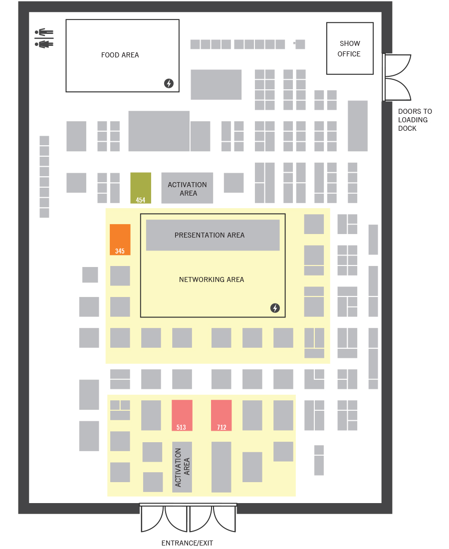
Visibility
We always look for spaces near the front door and high traffic areas. Being close to the front gives us a first sight, last sight lasting impression. Then we try to pick a spot near some of our core clients. We like our space to be close to our clients so they can use our space as a resource to show our products to their clients' end-users.
— Anonymous
Space #345
I resist the temptation to choose the largest footprint and instead opt for a versatile space that allows for accessibility, visibility, and positioning along the main attendee traffic path. Space #345 is close to high-traffic areas and would support most key exhibitor objectives. And an “activation-adjacent” area may be ideal for finding the balance between show floor energy and relative seclusion where a new product can be demoed.
— Halcie Svor-Bernstein, vice president, account services, Czarnowski
Space #513 or 712
I would choose #513 or #712 because your exposure is always higher on the main aisle near the entrance. Often the second booth in is better than the first because people tend to walk in the hall a bit and get their bearings before they enter a booth space. I think #513 has the edge over #712 because any activation area is typically non-commercial and has minimal architecture. This allows for more traffic and better sightlines into your space.
— Courtney Soice, CMO, Hamilton
Space #454
I think 20-by-30-foot island spaces can create a meaningful impact while saving money that can be put toward execution. Space #454 has a central location that's great for booth traffic. There are wide aisles on two sides of the space, which provide an unobstructed view from other booths. This space doesn't have columns or obstructions, and it's near the biggest booth at the venue, most likely the biggest company in the industry, so it will likely bring foot traffic to the space.
— Bart Henyan, brand strategist, Warehouse21
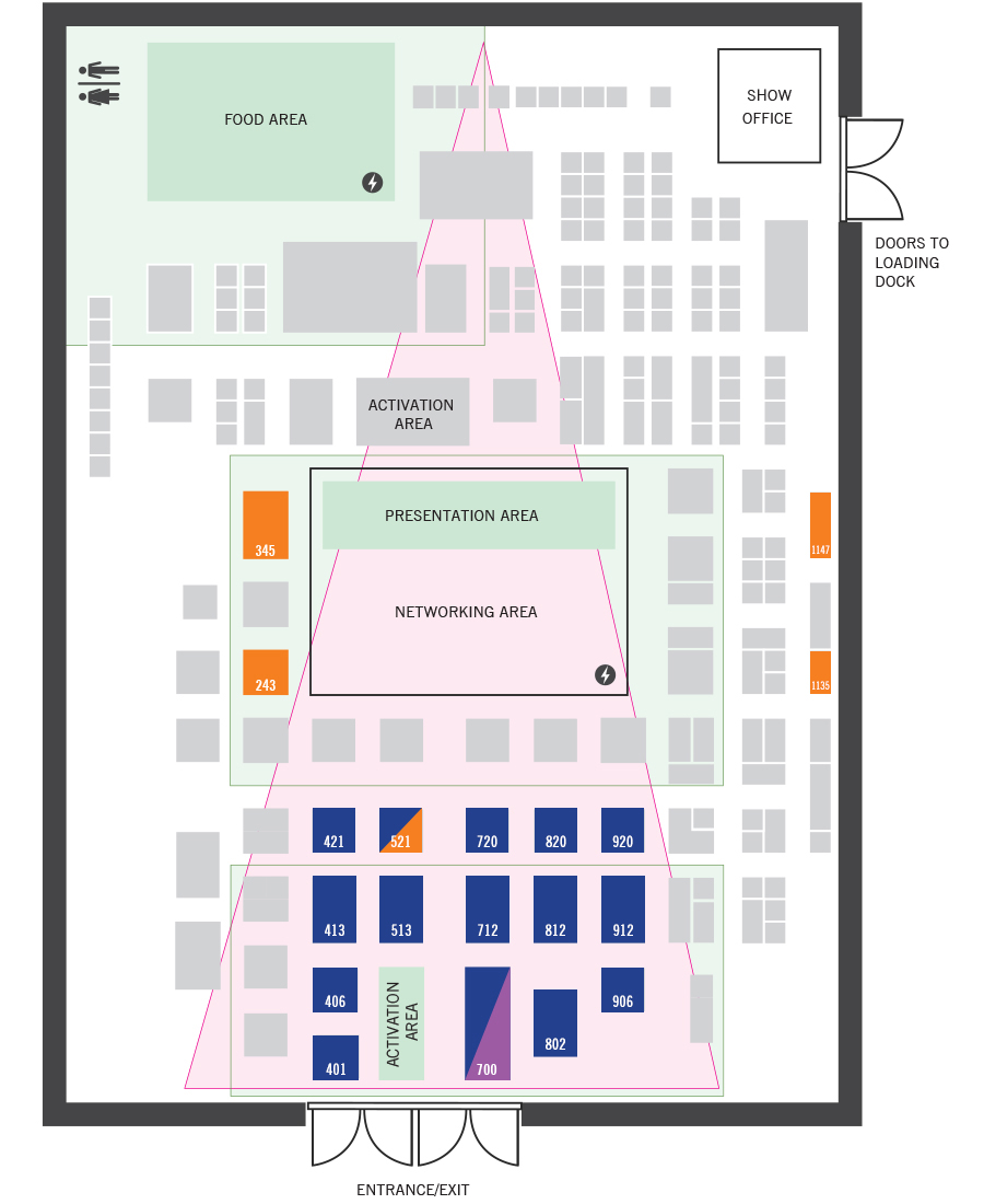
Space #700
I recommend exhibits closest to the entryway and down the front aisles because those will get the most attention and engagement before show attendees start experiencing information overload from all the visual stimulation throughout the hall.
Booth 700 is the best position centered on the entry doors. My second choices are #513, #521, #712, #720, #802, #812, and #820. Third choices are #401, #406, #413, #421, #906, #912, and #920.
My team and I always look at the show floor plan when a new design request comes in. It is important that visitors' first impression of the brand is memorable, favorable, and draws them in. The great thing about the booth numbers I listed above is that you can be certain of the angle from which visitors will first view the exhibit, so you can design the exhibit to make that first reveal really dramatic. Even if other angles of the exhibit are not as wonderful (though they certainly can be) that first impression is what will stick in the visitor's memory regarding that brand. And if your exhibit is #700, the first impression goes beyond the brand and is also the first impression of the whole show.
I also like the island exhibits directly around the large central networking area: #529, #728, #828, #928, #429, #329, #243, #339, #345, #932, #935, #938, #941, and #949. Show attendees will spend a lot of time in that central space, possibly taking a break. While in that area they will be aware of all those surrounding exhibits and see something that catches their eye, then go to check that exhibit out after being refreshed from their break. What is more challenging about those spaces is they are going to be approached from more sides, so there's not a clear first view. The booth can be designed to encourage entry from one side, or designed to be appealing on multiple sides, so it's not a dealbreaker, but from a design perspective, it's more challenging to make multiple views equally appealing.
— Katina Rigall Zipay, creative director, Classic Exhibits
Space #345 and #243
Under the assumption that the rules and regulations are full cubit content use, with no sight line or setback restrictions, I like booth space #345, which looks like a 20-by-30. I like the idea of having a long side of my exhibit facing the Networking Area because there would likely be fewer other exhibits 'blocking' our front. And although I typically avoid columns at all costs, I like that this column is at our backside. If columns hold firefighting equipment, by law they need to have a lot of clearance around them. Plus, some show halls park trash buckets at columns during a show.
If I wanted a 20-by-20, I'd choose #243 because the front can face the Networking Area, but is farther from the presentation part of the networking area. The lower side of that 20-by-20 can also feel like a very approachable front side, the space faces the hall entrance, and the column would be on the backside.
Another nice space for a 20-by-20 island is #521 because it feels like it has two main/wider aisles and it's not far from the entrance or the networking area.
If I desired a linear, due to budget, I would always try to secure a linear along the perimeter, but only if show rules allowed me to have an exhibit higher than 8 feet tall. Plus, an open corner is great. Spaces #1135 and #1147 are nice, but #1147 would be my first choice since there are no neighbors abutting.
Island peninsulas are my least favorite, both as an exhibitor and a designer. If the island peninsula has full cubit content rules, it is a little less painful. An island peninsula with standard island peninsula setbacks and sightline restrictions are the bane of my existence. They limit what you can do with the structure to help display a client's brand identity. Also, those rules and regs limit the amount of space you paid for on the topside of your carpet. Available functional space is limited, and the overall look, feel, and function of the exhibit is compromised.
And don't even get me started on an island under 30-by-40 with a column inside its space.
— Dana Esposito, EVP, strategy, BlueHive Exhibits
High Traffic
People think being near the entrance is best, but don't forget high traffic areas like food courts, restrooms, lounges, or theaters. Also consider the natural flow of attendees as they navigate the hall. Are there escalators that could boost your visibility? Is there a new product zone that attendees are likely to visit? Perhaps a high-profile speaker? These factors influence the attendee journey and can determine how much attention your booth receives.
— Sohini Mitra, strategic sales executive, MC2
Vector View
I draw a cone on the floor plan from the entrance to the back rear corners of the hall. I don't include the show office because no attendees are there, and I do include food court and bathrooms. Battery life is better, so proximity to charging stations is not a factor. My step two is looking for aisles that span the entire show, double wide aisles, and the intersection of those aisles, because that's likely to have higher traffic. Then I look at the front of the networking area because it will have people entering and exiting. Everyone has to go through the entrance, but not everyone will go to the back of the hall.
— Steve Deckel, CEO, Deckel & Moneypenny
Space #700
Space #700 is right on the main aisle leading to the networking area, and because it's impossible to miss, we could avoid spending a ton on rigging and high signage. That lets our client focus more on the attendee engagement in the space, which will pay greater dividends in terms of relationship building, quality lead gen, and pipeline.
— Jay Menashe, sales & marketing, EDE Corp.
We always look for spaces near the front door and high traffic areas. Being close to the front gives us a first sight, last sight lasting impression. Then we try to pick a spot near some of our core clients. We like our space to be close to our clients so they can use our space as a resource to show our products to their clients' end-users.
— Anonymous
Space #345
I resist the temptation to choose the largest footprint and instead opt for a versatile space that allows for accessibility, visibility, and positioning along the main attendee traffic path. Space #345 is close to high-traffic areas and would support most key exhibitor objectives. And an “activation-adjacent” area may be ideal for finding the balance between show floor energy and relative seclusion where a new product can be demoed.
— Halcie Svor-Bernstein, vice president, account services, Czarnowski
Space #513 or 712
I would choose #513 or #712 because your exposure is always higher on the main aisle near the entrance. Often the second booth in is better than the first because people tend to walk in the hall a bit and get their bearings before they enter a booth space. I think #513 has the edge over #712 because any activation area is typically non-commercial and has minimal architecture. This allows for more traffic and better sightlines into your space.
— Courtney Soice, CMO, Hamilton
Space #454
I think 20-by-30-foot island spaces can create a meaningful impact while saving money that can be put toward execution. Space #454 has a central location that's great for booth traffic. There are wide aisles on two sides of the space, which provide an unobstructed view from other booths. This space doesn't have columns or obstructions, and it's near the biggest booth at the venue, most likely the biggest company in the industry, so it will likely bring foot traffic to the space.
— Bart Henyan, brand strategist, Warehouse21
Space #700
I recommend exhibits closest to the entryway and down the front aisles because those will get the most attention and engagement before show attendees start experiencing information overload from all the visual stimulation throughout the hall.
Booth 700 is the best position centered on the entry doors. My second choices are #513, #521, #712, #720, #802, #812, and #820. Third choices are #401, #406, #413, #421, #906, #912, and #920.
My team and I always look at the show floor plan when a new design request comes in. It is important that visitors' first impression of the brand is memorable, favorable, and draws them in. The great thing about the booth numbers I listed above is that you can be certain of the angle from which visitors will first view the exhibit, so you can design the exhibit to make that first reveal really dramatic. Even if other angles of the exhibit are not as wonderful (though they certainly can be) that first impression is what will stick in the visitor's memory regarding that brand. And if your exhibit is #700, the first impression goes beyond the brand and is also the first impression of the whole show.
I also like the island exhibits directly around the large central networking area: #529, #728, #828, #928, #429, #329, #243, #339, #345, #932, #935, #938, #941, and #949. Show attendees will spend a lot of time in that central space, possibly taking a break. While in that area they will be aware of all those surrounding exhibits and see something that catches their eye, then go to check that exhibit out after being refreshed from their break. What is more challenging about those spaces is they are going to be approached from more sides, so there's not a clear first view. The booth can be designed to encourage entry from one side, or designed to be appealing on multiple sides, so it's not a dealbreaker, but from a design perspective, it's more challenging to make multiple views equally appealing.
— Katina Rigall Zipay, creative director, Classic Exhibits
Space #345 and #243
Under the assumption that the rules and regulations are full cubit content use, with no sight line or setback restrictions, I like booth space #345, which looks like a 20-by-30. I like the idea of having a long side of my exhibit facing the Networking Area because there would likely be fewer other exhibits 'blocking' our front. And although I typically avoid columns at all costs, I like that this column is at our backside. If columns hold firefighting equipment, by law they need to have a lot of clearance around them. Plus, some show halls park trash buckets at columns during a show.
If I wanted a 20-by-20, I'd choose #243 because the front can face the Networking Area, but is farther from the presentation part of the networking area. The lower side of that 20-by-20 can also feel like a very approachable front side, the space faces the hall entrance, and the column would be on the backside.
Another nice space for a 20-by-20 island is #521 because it feels like it has two main/wider aisles and it's not far from the entrance or the networking area.
If I desired a linear, due to budget, I would always try to secure a linear along the perimeter, but only if show rules allowed me to have an exhibit higher than 8 feet tall. Plus, an open corner is great. Spaces #1135 and #1147 are nice, but #1147 would be my first choice since there are no neighbors abutting.
Island peninsulas are my least favorite, both as an exhibitor and a designer. If the island peninsula has full cubit content rules, it is a little less painful. An island peninsula with standard island peninsula setbacks and sightline restrictions are the bane of my existence. They limit what you can do with the structure to help display a client's brand identity. Also, those rules and regs limit the amount of space you paid for on the topside of your carpet. Available functional space is limited, and the overall look, feel, and function of the exhibit is compromised.
And don't even get me started on an island under 30-by-40 with a column inside its space.
— Dana Esposito, EVP, strategy, BlueHive Exhibits
High Traffic
People think being near the entrance is best, but don't forget high traffic areas like food courts, restrooms, lounges, or theaters. Also consider the natural flow of attendees as they navigate the hall. Are there escalators that could boost your visibility? Is there a new product zone that attendees are likely to visit? Perhaps a high-profile speaker? These factors influence the attendee journey and can determine how much attention your booth receives.
— Sohini Mitra, strategic sales executive, MC2
Vector View
I draw a cone on the floor plan from the entrance to the back rear corners of the hall. I don't include the show office because no attendees are there, and I do include food court and bathrooms. Battery life is better, so proximity to charging stations is not a factor. My step two is looking for aisles that span the entire show, double wide aisles, and the intersection of those aisles, because that's likely to have higher traffic. Then I look at the front of the networking area because it will have people entering and exiting. Everyone has to go through the entrance, but not everyone will go to the back of the hall.
— Steve Deckel, CEO, Deckel & Moneypenny
Space #700
Space #700 is right on the main aisle leading to the networking area, and because it's impossible to miss, we could avoid spending a ton on rigging and high signage. That lets our client focus more on the attendee engagement in the space, which will pay greater dividends in terms of relationship building, quality lead gen, and pipeline.
— Jay Menashe, sales & marketing, EDE Corp.


Editorial
Time Thief
This moment, right now, is the only one that matters. The past is gone. And the future doesn't exist.
Exhibitor Q & A
Measurement
What are some tools that will help me track attendee movements, engagements, and more?
Exhibitor Q & A
Healthcare Certifications
What event marketing certificates exist in the healthcare field?
Ask Dan
No Thank You
My boss wants to promote me, but I like where I am. How do I turn down the promotion without hurting my career?
Exhibiting 101
Talking the Talk
What you need to know to effectively communicate with the labor crews you'll encounter.
Ammunition
Ideas That Work
These Boots Are Made for Throwing, Call of the Wild, Love Triangle, and more
Products
New Tools
Three Can't-Miss Product Launches
Portfolio
Bar Excellence
Here are six examples of top-shelf experiences that offer form, function, and style straight up.
Fixing Snafus
Hate to Burst your Pipe
Water can extinguish even the hottest events
Archive
Big Airy Deal
1910: California hosts the country's first noteworthy aviation show near Los Angeles.
Management
Stress Check
Expert Andy Core offers his tried-and-true tips for helping teams stop stress before it starts.
Quiz
Light Up and Sound Off
Test your audiovisual knowledge! See if you can tell your aspect ratio from your LCD.
Strategy
Space Case
Choosing space on a trade show floor requires a combination of strategy and luck.
Exhibit Design Awards
EXHIBITOR Magazine's 38th Annual Exhibit Design Awards
Honoring the best trade show exhibit designs in the world.
Exhibit Design Awards
Scents and Sensibility
L'Oreal Singapore's booth combined the elegance of an Architectural Digest living room with the calm of a Zen garden.
Exhibit Design Awards
Waste Not, Want Not
Nippon Paper Crecia Co. Ltd. proved that sustainability and style can go hand in hand.
Exhibit Design Awards
A Fine Mesh
When Asada Mesh Co. Ltd. made its debut at Japan Shop 2023, they offered a glimpse into the future of metal mesh.
Exhibit Design Awards
Vision Quest
Telios Pharma's booth not only captivated visitors and relayed the product story but also generated product awareness.
Exhibit Design Awards
Artful Precision
Morita created the Morita Museum to elevate its dental tools into gallery-worthy architectural pieces of art.
Exhibit Design Awards
Chain Reaction
The walls were made of 2,725 pounds of aluminum chain which turned the booth into an interactive piece of kinetic art.
Exhibit Design Awards
Back in Black
Dematic Corp. defied industry expectations by creating a highly immersive, digitally focused booth.
Exhibit Design Awards
Dream Weaver
Toyota Boshoku wove its past and its future together under one spectacular roof at the Japan Mobility Show 2023.
Exhibit Design Awards
Big Pasta-Bilities
Carbe Diem's booth showcased a striking mix of earthy, on-brand tones and modern design elements.
Exhibit Design Awards
Hot Shot
The modular exhibit from Walgreens featured identical paint and wood finishes as an in-store environment.
Exhibit Design Awards
Petal to the Metal
The Hong Kong Trade Development Council's fashion show combined nature and tech to bring a futuristic garden to life.
Exhibit Design Awards
Bathing Beauties
House of Rohl's seven brands took center stage at KBIS 2024 in a cohesive and award-winning stand.
Exhibit Design Awards
Trip the Light Fantastic
Lightbox Jewelry's booth showcased its lab-grown diamonds by featuring a lab-like interior and a shimmering exterior.
Exhibit Design Awards
EDA Honorable Mentions
Here are this year's Exhibit Design Awards Honorable Mentions.
Best of
EXHIBITOR Magazine's 10 Most Read Stories of 2024
Read the stories that generated the most online traffic in 2024.